Case: Maxima fitness club website development | Creonit
Maksima
www.fcmaxima.ru

Maksima

The website of the fitness club

Project launch date — March 2015

Situation

Maxima fitness club has been operating in Barnaul since 2006 and confidently occupies the "average plus" niche in the city market. A good location (densely populated new buildings), a pleasant atmosphere inside and a good balance of service and cost of cards-all this makes the club quite visited. However, the activity of competitors is forced to reconsider their approach to communications and use dormant channels, in particular, the site.

Problem

The site was made many years ago and is hopelessly behind the times. Against the background of fresh sites of competing clubs, it looked depressing and formed a completely false impression of what awaits the client in the club. Obvious problems that urgently needed to be solved: outdated design, difficult and inconvenient navigation, no up-to-date information about club maps, it is almost impossible to see the class schedule, and there are no working feedback channels.

Aim

Develop a modern presentable and functional website, add interactive content. Develop a new sales channel for online services.

Solving

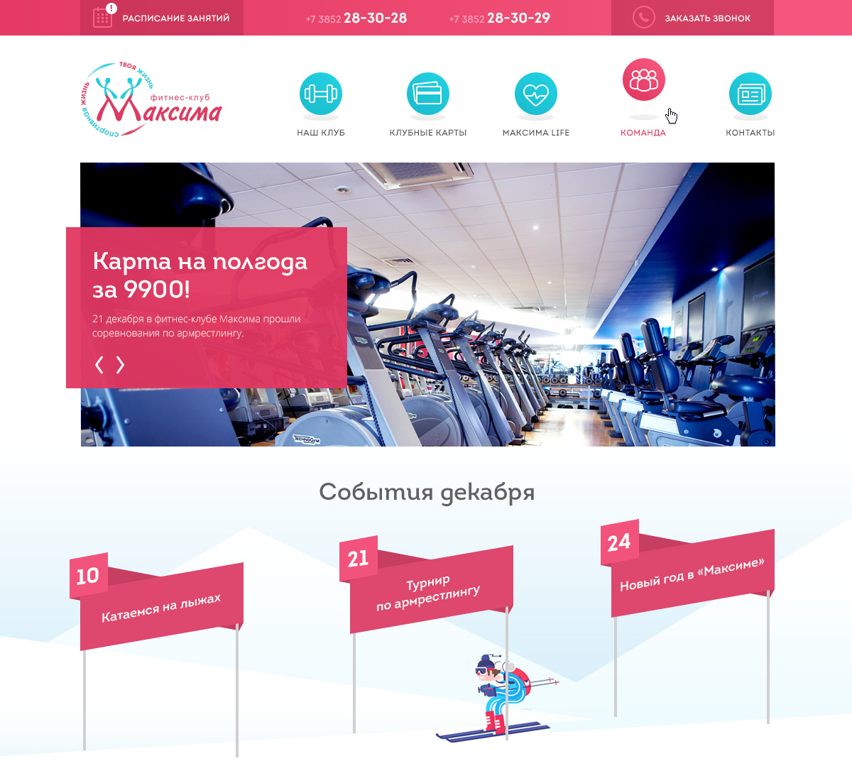
  • Carry all the excess. Simplify navigation and get rid of multi-level structures. Now a potential client will find information about the club's services and club cards in one click, and the class schedule does not need to be downloaded in XLS format.
  • Make the site as lively and interactive as possible. Signs with the events of the next month, seasonal landscapes: in the spring, the snow came down from the mountains, and the skier switched to a Bicycle.
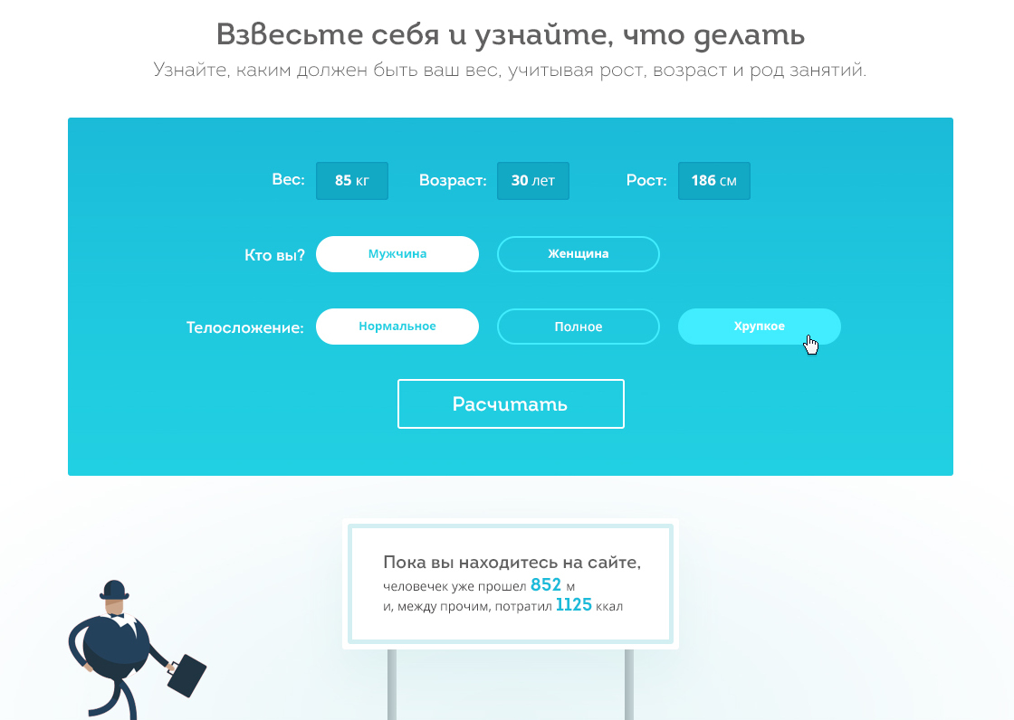
  • The interactive form "Weigh yourself" contains recommendations on the training program and nutrition, as well as invites you to a guest visit with a 50% discount.
  • Our favorite character, who cheerfully burns calories while you sit on the site, migrated from the previous version of the site, but in a much more charming appearance.
  • A special reason for pride "Maxima» - an incredibly wide range of club cards for different ages, situations, with different content and expiration dates. To make this information easier to navigate, we have developed a filter that allows you to choose a personalized offer and, without leaving your computer, immediately applies for a card.
  • The class schedule also has a filter that allows you to create an individual program (and then print it out so you don't forget). The lesson card contains all the necessary information about it. It is possible to pre-register for lessons via the website.

What we did

  • conducted an audit of the old site;
  • analyzed the competitors' sites;
  • made a technical task;
  • drew a new design;
  • developed a website;
  • edit the text;
  • optimized the site for search engines;
  • set up statistics collection;
  • conducted an offline advertising campaign under the slogan "Consider it's Monday".

Result

During the month, the site traffic doubled (now it is 1000 unique visitors).

The average time on the site and the depth of viewing has significantly increased.

Feedback forms are actively working, conversion rates have improved (more than 70 requests for the first month of work, a significant part of these people later communicate by phone with the Manager, come to guest visits, and purchase cards).

Irina Vlasova
Director of the "Maxima" fitness club
Irina Vlasova

Fitness is about being in good shape. We wanted to achieve the same characteristics for the site.

In the previous version of the site, there was no possibility of further technical and functional development. Our goal was to make the site's architecture and navigation simple and convenient, with a modern design. It turned out that sites have their own fashion and couturiers. "Fashion verdict" was signed by Creonit, for which we are very grateful to them.

There was a lot of work, as I had to change everything. As a result, we got a modern site with filters on the schedule and an alarm about its changes. Clients now have the opportunity to sign up for training sessions via the website.

In the "club cards" section (and we have more than 30 types of them), we created a filter, which greatly facilitates the process of choosing a client.

We have implemented feedback forms for current and potential clients. Soon, we plan to introduce a personal account for our clients, which will expand the site's capabilities.

Thank you to Project Manager Ana Kohlmiller for her patience and professionalism, incredible charm, and ability to convince the client when in doubt.

Good luck to you and new clients with the most incredible and interesting tasks. I'm sure you can handle them!

Thanks for your attention

Let's discuss your project
Alexandra Shevchenko
Account manager
Alexandra Shevchenko

We will receive your request and send you an offer within 24 hours with an approximate estimate of the development cost and clarifying questions. After that, we will call you and discuss the project’s goals and requirements. And let’s get started.

Microblog