Case: development and support of the MeiTan online store | Creonit
MeiTan
meitan.ru

MeiTan

Landing and E-Commerce app

Project launch date — September 2016

Situation

Meitan is a cosmetics company that sells its products through a network of consultants.

At the beginning of our work:

  • more than 350 open representative offices;
  • presence in 7 countries;
  • 200,000 consultants;
  • the site, made 5 years ago, requires serious processing and does not solve the company's business problems.

Aim

  • Put in order a huge amount of content, simplify the structure, and facilitate navigation.
  • Create separate landing pages for potential consultants and partners of the company, tell them about existing business opportunities, and encourage them to register.
  • Redesign the online store: simplify the catalog structure, improve conversion, and add new features that make it easier to place an order.
  • Adapt the site to mobile devices.
  • Develop a convenient tool for creating websites of regional representative offices using a single template.

Analytics and designing

The site's audience is divided into two large groups whose behavior differs. Potential consultants are interested in business opportunities, registration conditions, and information about the benefits of working with the company. Buyers of cosmetics need a clear catalog of cosmetics, a good description of products, and convenient ordering. The path to each goal should be as simple and short as possible.

Anton Makarov
Project Manager
Anton Makarov

The problem with the old site was an unnecessarily complex structure. A user who came to the site for the first time was almost unable to get an idea of where they were. The menu, which is impossible to navigate, did not encourage further study of the product catalog or business opportunities. We were faced with a difficult task: to save all the considerable amount of content, to structure it, to shorten and simplify the path to each goal as much as possible.

Landing pages

One of the important tasks of the site is to tell potential partners and consultants about the company's business opportunities.

We designed and drew several landing pages:

  • for those who want to become a consultant,
  • for consultants who want to open a regional representative office.
Natasha Tereshkina
Designer
Natasha Tereshkina

The site is very large, it has a lot of things. My goal was to make it clean, convenient, without noise. Therefore, we decided to use two colors as a basis: white and branded red. We have developed unique landing pages for different collaboration options. We have especially drawn a lot of icons that add personality to the site and illustrate the steps, sections, and benefits.

Online-store: everything is new

  • Updated menu: the site user will not be lost among the unknown names of product groups, and can view products not only by series but also by category.
  • Attractive product card: minimalistic, with a large photo. Focus on the content.
  • Convenient predictive search.
  • To increase the average receipt, we added the "Comprehensive care" and "Recommendations" blocks to the product page, which offer to Supplement the purchase and get a discount. 
    • A gift to choose from for an order for a certain amount.
    • Promo code for a gift, promo code for a discount-actively used in mailing lists.
    • Tags are recorded in orders.

Delivery

The company uses two delivery methods: Russian Post and DPD. The problem was that when we were working on the project, the Russian Post didn't have an API. So we had to figure out how to simulate their algorithms on the customer's site.

The delivery area is divided into zones with regions and cities attached to them. The location is determined by GeoIP or specified by the user independently. Accordingly, the cost is calculated based on the link to the belt.

Additional difficulties were created by the difference in approaches to calculating the delivery of Russian Post And DPD

  • different number of zones, respectively, some cities were assigned to different zones at the same time;

  • different delivery methods: Express, air, and so on;

  • list of Russian Post exception cities with very high delivery costs (for example, remote localities where delivery depends on the season and weather);

  • mismatch of delivery rates for Meitan and DPD — setting up an automatic selection of the most appropriate one.

Anton Makarov
Project Manager
Anton Makarov

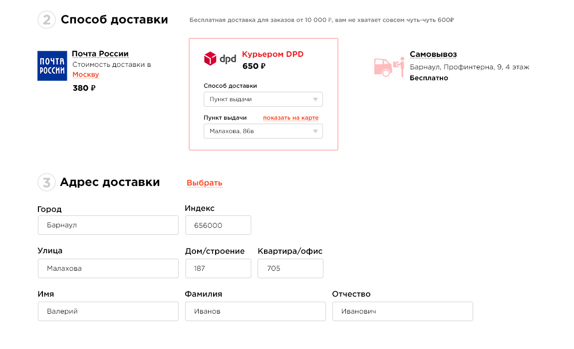
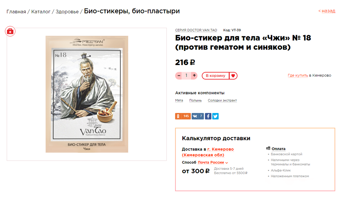
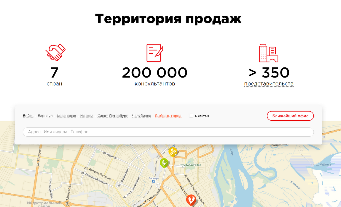
Our task was to make available for ordering regions where there are no representative offices of the company, including remote ones. Moreover, the cost of delivery at the time of placing the order should already be accurately calculated. Mistakes, on the one hand, could alienate the client, on the other, make the execution of the order unprofitable for the company. The logistics Department cooperated with us, put forward many conditions and requirements that we implemented on the site.

Widgets for content

The site has a lot of static pages that the customer fills in independently. To facilitate this work, we have implemented widget blocks for content design.

Anton Makarov
Project Manager
Anton Makarov

Together with the customer, we thought out which blocks to draw: image, text, fact, quote, tag, video. In the administrative panel, it is easy to assemble a page from ready-made blocks that look good and, most importantly, does not require any additional time and external specialists to create it.

The sub-sites for regional offices

For each regional representative office (and the company has dozens of them), you can use the control panel to create a site based on a common template, but with your own content, connecting and combining the necessary modules and blocks. As a result: each representative office has its own online store with its own delivery options.

Summary

  • Integration with 1C
  • Increasing the average receipt: comprehensive care, gifts for orders for a certain amount
  • Promo codes for discounts and gifts
  • Two payment systems: Yandex.Cash and Sberbank
  • Complex calculation of delivery costs for Russian Post and DPD

Result of work

  • Information about the company is structured and presented in an accessible form, which allows you to maximize the use of the site as a presentation tool.
  • Increased online store conversion, easier interaction with the catalog, and the purchase process.
  • The client's time and financial expenses for supporting the main site, sub-sites, and mobile app are significantly reduced.

Development plan

The new website was launched in September 2016, and the consultant's personal account was launched in October. In July 2017, we launched an online store for the company's consultants and a referral program.

But our joint and fruitful work did not stop there. We continue to support and develop the site, introduce new features, and help the customer solve new problems.

35
layouts
8
months of development
70
pages of technical specification

Thanks for your attention

Let's discuss your project
Alexandra Shevchenko
Account manager
Alexandra Shevchenko

We will receive your request and send you an offer within 24 hours with an approximate estimate of the development cost and clarifying questions. After that, we will call you and discuss the project’s goals and requirements. And let’s get started.

Microblog