Case: developing a platform for online education UCHOO | Creonit
UCHOO
uchoo.ru

UCHOO

Online educational platform

Project launch date — June 2020

We have developed an online platform with our own video communication system and a functional personal account for students and Tutors.

  • Admin panel
  • Teacher directory and teacher's detailed page
  • Personal accounts of the teacher and the student
  • Lesson’s schedule
  • Different checkout scenarios for different types of users
  • Mass payments to teachers
  • Lessons with a payment system
  • Video communication system

Client

UCHOO is a startup that approached us with the idea of creating an educational platform for finding the best Tutors and students.

Project aim and process

To begin with, we delved into the online education market and conducted analytics. So we were able to come to a consensus on the implementation of the project in two stages and determine their final composition.

Then we launched a landing page for teachers and used it to build a preliminary database of teachers. This was necessary so that students could use the platform and choose teachers immediately after the project was launched.

The first release allowed students and teachers to register on the platform and fill out their profiles. Also, at this point, we have implemented a catalog of teachers, consisting of the main page, General information, a list of courses and lessons.

By the time of the second release, the platform began to function: the teacher's schedule, conducting a trial lesson, booking lessons, and courses, payment on the site and mass payments to teachers from the site, a video communication system, accrual of payments based on the results of lessons, and a Commission system on which the platform itself earns.

Next, the platform will have beta testing and launch an advertising campaign to attract students to the already filled catalog of teachers.

Planing and designing 

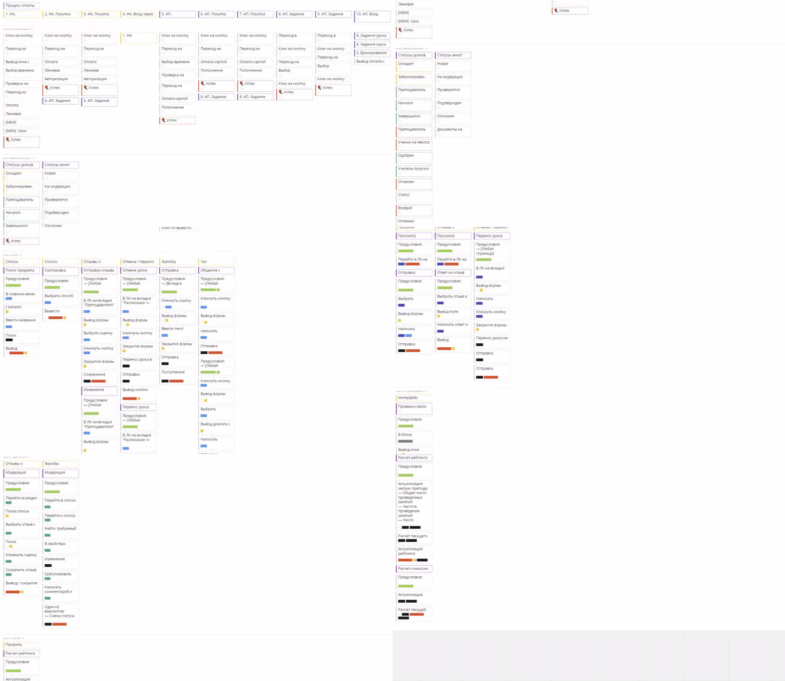
UCHOO is a very large and functional platform. The work started with the segmentation of the target audience and analysis of sites with similar topics. After that, we were able to create a project structure and a description of how users will interact with it, in the form of a flowchart.

Before we start developing a design concept, we put together a visual brief.

Working on the design, we focused on convenience and minimalism, with the addition of unique and recognizable features. The project contains a fairly rich functionality, so the main task is to present it correctly so that it is convenient for both students and teachers to work with it.

Stas Khromushin
Designer
Stas Khromushin

Additionally, the corporate identity was implemented, which, in addition to colors and fonts, also included a logo. it was developed based on the main advantages and values of the project, namely: convenience, fast communication, and a modern approach to learning. In fact, this is how recognizable features in the logo were born, resembling convenient and fast communication between a teacher and a student.

Implemented functions

Admin panel

From the first stages of working on the project, it was clear that there will be a lot of releases, which means that the speed of work on it will also be important. Also, an online educational platform implies high loads. That's why we chose a solution that allows you to scale and implement non — standard functionality-the Symfony framework.

Also, we knew that one day the project would need a mobile app. The client also had other plans for the future. Based on this, we decided on the API Based methodology, which allows you to build an infrastructure of several products around a single API.

The admin panel is designed to store transactions and lesson histories.

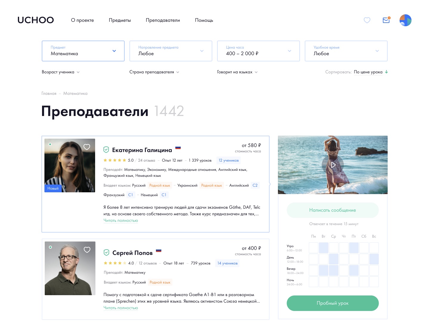
Catalog

The catalog of registered teachers consists of the following elements:

  • A header with the total number of teachers on the platform.
  • Filter by: subjects; directions; cost; convenient time; teacher's country; language the teacher speaks; student's age.
  • Sort by price and popularity.
  • A list of teacher previews that match the specified filtering parameters.
  • Paginated navigation block.

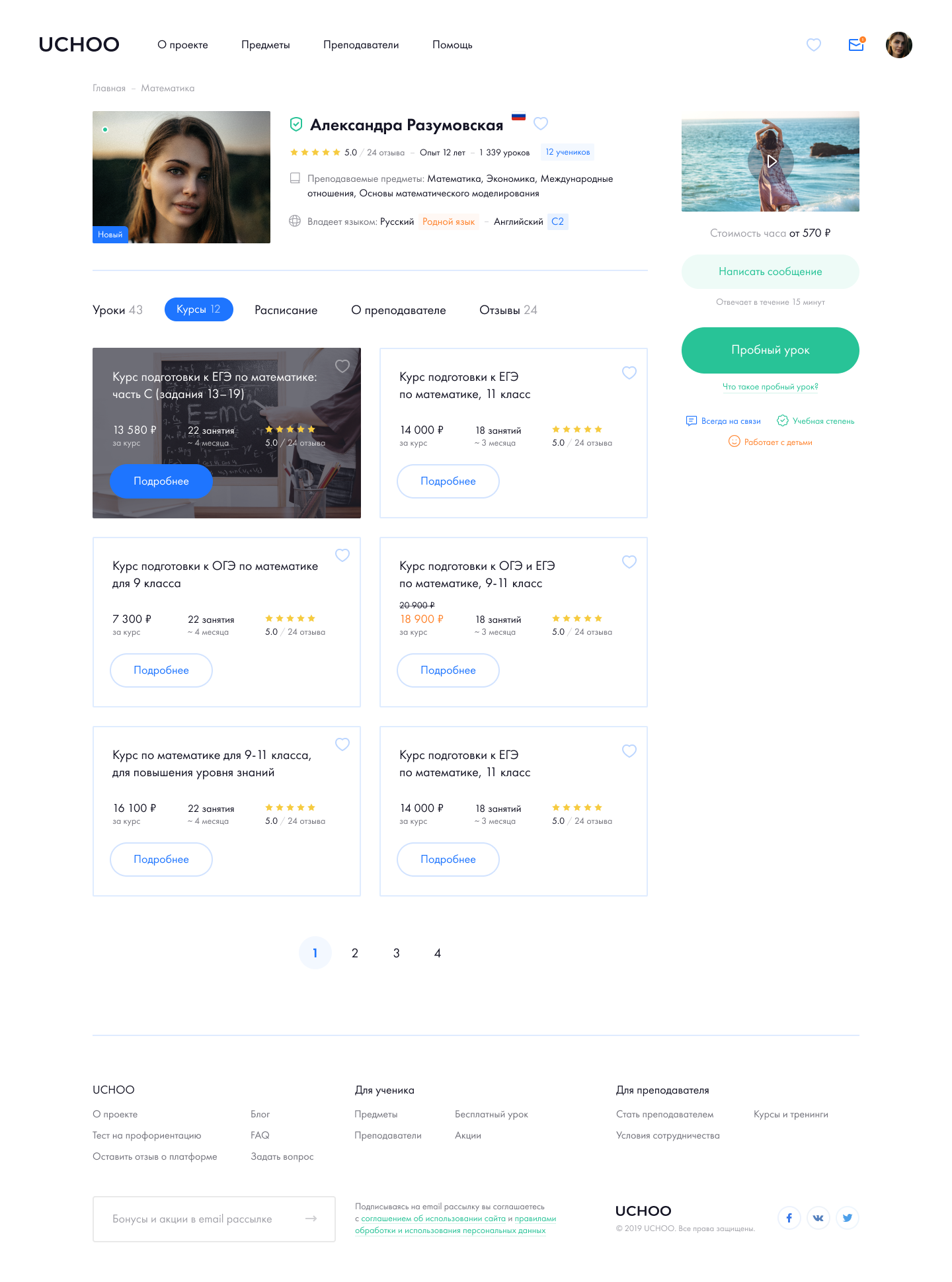
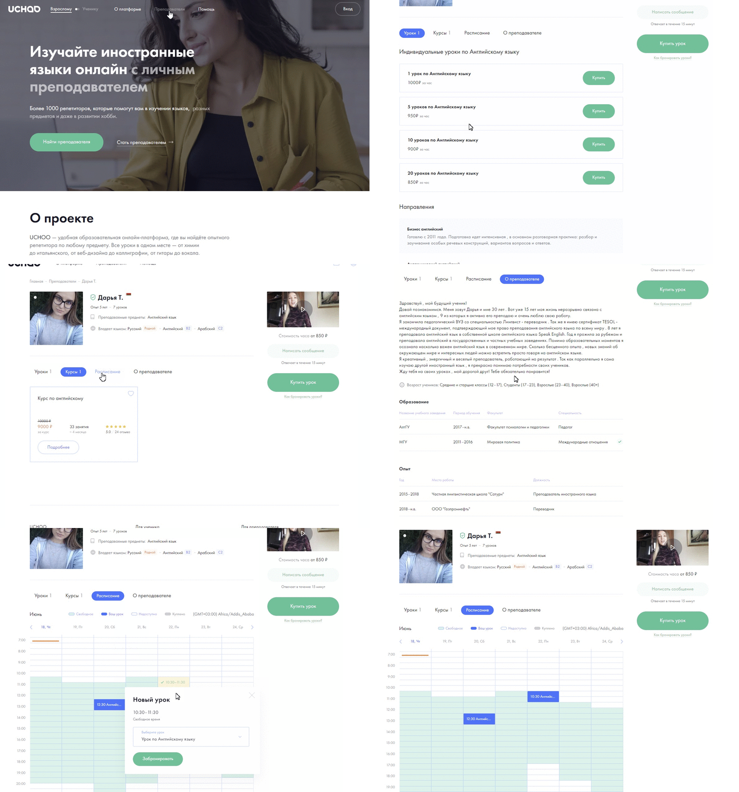
The teacher's detailed page consists of:

  • Block with general information.
  • Profile menu.
  • Tab "About the teacher".
  • "Lessons" Tabs.
  • "Courses" Tabs.
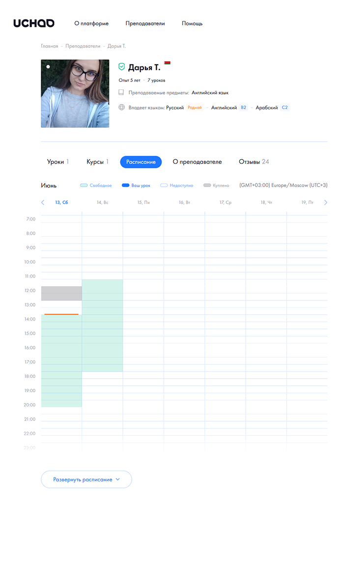
  • "Schedule" tab
  • Feedback’s block.

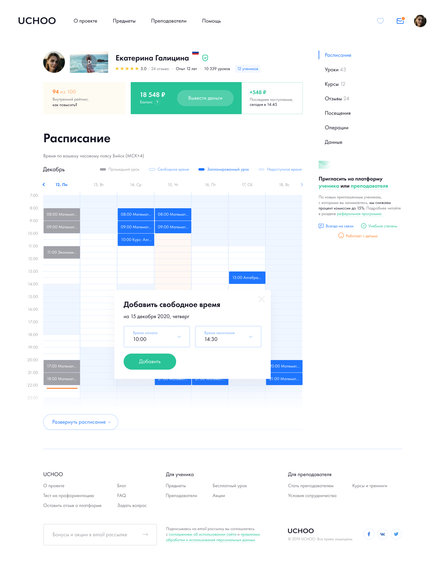
Account and schedule grid

The teacher's personal account is designed so that the teacher can easily and simply make up their work schedule, choosing free and busy hours.

Teachers of the UCHOO platform can conduct free trial lessons to win over potential students and understand the challenges they face. Students, in turn, can choose the most suitable teachers for themselves. To do this, they have the opportunity to take a 30-minute trial lesson with an unlimited number of teachers. The only condition for a student is to make a Deposit on their balance, which can then be spent on paid lessons.

— The teacher can independently decide whether to conduct a trial lesson or not and regulate it in their personal account.

— Lessons are divided into three categories: trial, individual, and within the framework of the training course.

— When a student gets to the teacher's public page, they immediately see that the teacher is busy and can choose a convenient time for the lesson.

Payments to teachers

To choose a service that is suitable for the client's business, we studied about 15 payment systems. It would seem that there are a lot of services, and you can choose anyone. But in reality, everything is more complicated: it is the payment system itself that chooses who to cooperate with and conducts a lot of checks. And here's why.

In our case, the platform is an intermediary. The money that students pay is stored in the teacher's internal account and is credited automatically after the lesson is completed successfully. For a person to withdraw the earned money to the card, a service for mass payments to individuals is required. Such a scheme, an intermediary platform, seems suspicious to the security services of many payment systems. Some of them ask for tax justification and almost financial statements, and some may even ignore the request. As a result, we managed to find a common language with one of the many payment systems. One of the selection criteria was Commission percentage.

We also needed a whole package of different documents — this is important for both the tax service and the payment system. We recommended a proven team of lawyers who specialize in IT to the client.

We have implemented the teacher commission scale: it is progressive and changes depending on the number of lessons held on the platform.

Purchase and lesson’s booking

We have provided different order processing scenarios for authorized and unauthorized users. The platform also has the option of "lazy" registration.

The type of lesson affects how the payment page looks. As we mentioned earlier, the lesson can be a trial, individual (with the possibility of purchasing packages), and as part of the training course.
A small Commission above the lesson fee is a license fee that goes to improve and maintain the platform.

Video communication

We began to consider possible services for organizing video communication at the stage of writing the technical task and deployed three of them on the test stand. The following parameters were important:

  • Record video and audio streams to a file.
  • Screen sharing.
  • Documentation.
  • Tools for development.
  • Project development activity.
  • Implementation in the site infrastructure.
  • Horizontal scalability.
Pavel Bondarovich
CTO
Pavel Bondarovich

First, we conducted research and settled on https://flashphoner.com/. And after the research, it was easy to implement the system. So far, we have allocated one separate media server, but when the load increases, we will raise additional ones.

In general, UCHOO is interesting because we used the middle-end, written in Node.js, for instant communication between the user and the browser via WebSocket. For example, notifications about the start or end of a lesson and other events in the lesson lifecycle are sent in this way. The RabbitMQ message queue is used for communication between the site (PHP) and the middle-end (Node.js).

Results

Beta testing of the platform is in full swing: the client managed to collect about 300 applications from teachers using the landing page, which was made on Tilde. Now is the time to test the hypotheses accumulated during the analytics stage and collect feedback from users.

New features are ahead, and from the nearest: introduction of reviews, rating for teachers, interactive whiteboard for the lesson, as well as adding a screen sharing function.

Thanks for your attention!

Let's discuss your project
Alexandra Shevchenko
Account manager
Alexandra Shevchenko

We will receive your request and send you an offer within 24 hours with an approximate estimate of the development cost and clarifying questions. After that, we will call you and discuss the project’s goals and requirements. And let’s get started.

Microblog